ITEEDU
Common Layout Objects
The following are the most common view groups you'll use in your applications. This gives some basic information about each type; for in-depth detail, see the linked reference page topic for each.
FrameLayout
FrameLayout is the simplest layout object. It is intended as a blank reserved space on your screen that you can later fill with a single object — for example, a picture that you'll swap out. All child elements are pinned to the top left corner of the screen; you cannot specify a location for a child of a FrameLayout. Later children will simply be drawn over earlier objects, partially or totally obscuring them (unless the newer object is transparent).
LinearLayout
A LinearLayout aligns all children in a single direction — vertically or horizontally, depending on what property you set on the LinearLayout. All children are stacked one after the other, so a vertical list will only have one child per row, no matter how wide they are, and a horizontal list will only be one row high (the height of the tallest child, plus padding). LinearLayout respects margins between children, and also gravity (right, center, or left alignment of a child).
LinearLayout also supports assigning a weight to individual children. This value allows children to expand to fill any remaining space on a screen. This prevents a list of small objects from being bunched to one end of a large screen, allowing them to expand to fill the space. Children specify a weight value, and any remaining space is assigned to children in the proportion of their declared weight. Default weight is zero. So, for example, if there are three text boxes, and two of them declare a weight of 1, two of them will expand equally to fill the remaining space, and the third will not grow any additional amount.
Tip: To create a proportionate size layout on the screen, create a container object that is fill_parent, assign the children heights or widths of zero, and then assign relative weight values to each child, depending on what proportion of the screen each should take.
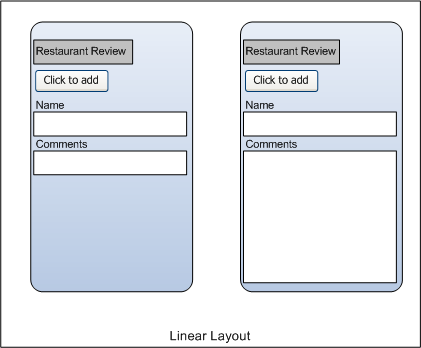
The following two forms represent a LinearLayout with a set of elements: a
button, some labels, some text boxes. Both have padding values to adjust the
padding nicely. The text boxes have their width set to FILL_PARENT; other
elements are set to WRAP_CONTENT. The gravity, by default, is left. The form
on the left has weight values unset (0 by default); the form on the right has
the comments text box weight set to 1. If the Name textbox had also been set
to 1, the Name and Comments text boxes would be the same height.
Within a horizontal LinearLayout, items are aligned by the position of
their text base line (the first line of the first list element — topmost or
leftmost — is considered the reference line). This is so that people scanning
elements in a form shouldn't have to jump up and down to read element text in
neighboring elements. This can be turned off by setting
android:baselineAligned="false" in the layout XML.
TableLayout
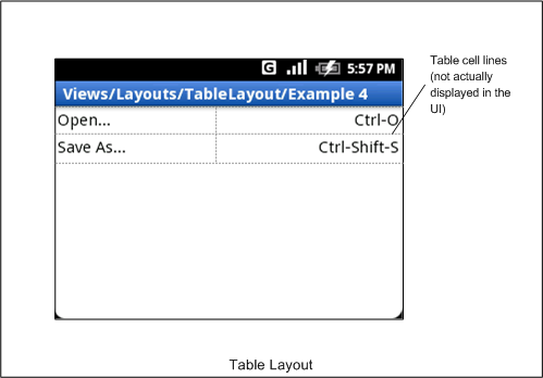
TableLayout positions its children into rows and columns. A TableLayout consists of a number of TableRow objects, each defining a row (actually, you can have other children, which will be explained below). TableLayout containers do not display border lines for their rows, columns, or cells. Each row has zero or more cells; each cell can hold one View object. The table has as many columns as the row with the most cells. A table can leave cells empty. Cells cannot span columns, as they can in HTML. The following image shows a table layout, with the invisible cell borders displayed as dotted lines.
Columns can be hidden, can be marked to stretch to fill available screen space, or can be marked as shrinkable to force the column to shrink until the table fits the screen. See the reference documentation for this class for more details.
AbsoluteLayout
AbsoluteLayout enables children to specify exact x/y coordinates to display on the screen, where (0,0) is the upper left corner, and values increase as you move down or to the right. Margins are not supported, and overlapping elements are allowed (although not recommended). We generally recommend against using AbsoluteLayout unless you have good reasons to use it, because it is fairly rigid and does not work well with different device displays.
RelativeLayout
RelativeLayout lets children specify their position relative to each other (specified by ID), or to the parent. So you can align two elements by right border, or make one below another, or centered in the screen. Elements are rendered in the order given, so if the first element is centered in the screen, other elements aligning themselves to that element will be aligned relative to screen center. If using XML to specify this layout (as described later), a referenced element must be listed before you refer to it.
Here is an example relative layout with the visible and invisible elements outlined. The root screen layout object is a RelativeLayout object.
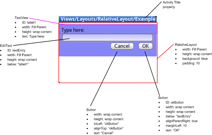
This diagram shows the class names of the screen elements, followed by a list of the properties of each. Some of these properties are supported directly by the element, and some are supported by its LayoutParams member (subclass RelativeLayout for all the elements in this screen, because all elements are children of a RelativeLayout parent object). The RelativeLayout parameters are width, height, below, alignTop, toLeft, padding, and marginLeft. Note that some of these parameters support values relative to other children — hence the name RelativeLayout. These include the toLeft, alignTop, and below properties, which indicate the object to the left, top, and below respectively.
Summary of Important View Groups
These objects all hold child UI elements. Some provide visible UI, and others only handle child layout.
| Class | Description |
|---|---|
| AbsoluteLayout |
Enables you to specify the location of child objects relative to the parent in exact measurements (for example, pixels). |
| FrameLayout | Layout that acts as a view frame to display a single object. |
| Gallery | A horizontal scrolling display of images, from a bound list. |
| GridView | Displays a scrolling grid of m columns and n rows. |
| LinearLayout | A layout that organizes its children into a single horizontal or vertical row. It creates a scrollbar if the length of the window exceeds the length of the screen. |
| ListView | Displays a scrolling single column list. |
| RelativeLayout | Enables you to specify the location of child objects relative to each other (child A to the left of child B) or to the parent (aligned to the top of the parent). |
| ScrollView | A vertically scrolling column of elements. |
| Spinner | Displays a single item at a time from a bound list, inside a one-row textbox. Rather like a one-row listbox that can scroll either horizontally or vertically. |
| SurfaceView | Provides direct access to a dedicated drawing surface. It can hold child views layered on top of the surface, but is intended for applications that need to draw pixels, rather than using widgets. |
| TabHost | Provides a tab selection list that monitors clicks and enables the application to change the screen whenever a tab is clicked. |
| TableLayout | A tabular layout with an arbitrary number of rows and columns, each cell holding the widget of your choice. The rows resize to fit the largest column. The cell borders are not visible. |
| ViewFlipper | A list that displays one item at a time, inside a one-row textbox. It can be set to swap items at timed intervals, like a slide show. |
| ViewSwitcher | Same as ViewFlipper. |